
Charting Tools for Binary Options
Now that we know some of the basic strategies that a new trader can employ, it is time that we learn how to read stock charts that indicate the movement of the prices. This will allow us to make better decisions regarding the momentum and direction of a price, and thus make profit from our predictions. As we go along and learn more complex details about trading binary options, we tend to get better. This means that we could get greater profit for lesser risk.
The way data is presented for binary options is through charts. A stock chart or an asset chart is simply a graph with the price of an asset located on the
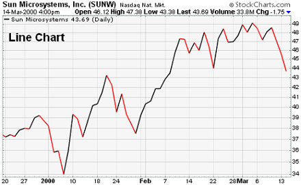
Being able to read a stock chart is an essential skill for anyone who wants to enter into binary options. Charts can be interpreted to give an indication of which direction a stock may be headed. The most commonly used chart is the line chart, which is based on the stock’s closing price for the day. The line chart is most effective when viewing a chart’s historical prices.
Below is an example of a line chart for stock prices of Sun Microsystems Inc. Here we can see how the
Parts of a Stock Table
Many price data of stocks are not presented graphically. Instead, they are presented as small elements called a stock table. The stock table pretty much works like a stock chart, but may contain more information, although the information may not be presented clearly as with stock charts. Still, a stock table is useful for a binary options trader, especially when looking into historical data that may affect subsequent price movements.
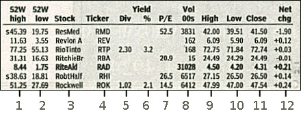
Above is an example of a stock table for different companies such as ResMed, Revlon, etc. Below are the descriptions of the columns as labeled by the numbers below the image:
- 52-Week High — The highest prices at which a stock has been traded over the previous year (52 weeks). This typically does not include the previous day’s trading.
- 52-Week Low — The lowest prices at which a stock has been traded over the previous year Does not typically include the previous day’s trading.
- Company Name and Type of Stock — This lists the name of the company. The company offers a common stock if there are no special symbols or letters following the name. There are different symbols that imply different classes of shares. For example, “pf” means the shares are preferred stock.
- Ticker Symbol — This is the unique alphabetic name which identifies the stock. Financial shows on T.V., shows the ticker tape moving across the screen, quoting the latest prices alongside this symbol. If you are looking for stock quotes online, you always search for a company by the ticker symbol. Google also shows the ticker symbol when you search for a company.
- Dividend Per Share — Indicates the annual dividend payment per share. If blank, the company does not currently pay out dividends.
- Dividend Yield — The percentage return on the dividend. Calculated as annual dividends per share divided by price per share.
Price-Earnings Ratio — The values in this column are calculated by dividing the current stock price by earnings per share from the last four quarters.- Trading Volume — This figure shows the total number of shares traded for the day, listed in hundreds. Heavily traded stocks show a higher volume than the others. For this example of a stock table, this volume is in the hundreds.
- Day High — This column indicates the maximum price that people have paid for the stock.
- Day Low — This indicates the minimum price that people have paid for the stock.
- Close — This column shows the last trading price recorded when the market closed for the day. If the closing price is up or down more than 5% than the previous day’s close, the entire listing for that stock is
bold-faced . This price is not guaranteed if you buy the stock the next day because the price is constantly changing, even after the exchange is closed for the day. The close is merely an indicator of past performance and except in extreme circumstances serves as a ballpark of what you should expect to pay. - Net Change — This is the dollar value change in the stock price from the previous day’s closing price. When you hear about a stock being “up for the day,” it means the net change was positive. Some tables show red and green font colors to easily show the direction of the price for the day.
Characteristics of a Good Stock Chart
The use of these charts may differ from trader to trader but the basic components and usage is the same for across the trading field. Different chart modes and display help different types of binary options trader, depending on the level of expertise and skill.
Here are some examples of characteristics that many traders look for in stock charts:
- Good charts have the ability to switch between different modes such as Regular Stock Chart Mode and Logarithmic Display Stock Chart Mode.
- Good charts have a second line that shows the incremental return generated by dividend distributions.
- Some traders look for a third line that shows the total return generated by buying and holding a stock and reinvesting all dividend distributions.
Learning how to read the charts is an essential part of options trading because the charts serve as the primary technical analysis tool for binary options trading. Many charts may seem quite overwhelming for the new user. The media has also hyped up the use of these charts where many T.V. shows and movies show traders using multiple monitors looking at numerous charts all day. While the truth is, anyone can trade binary options using just one computer monitor.
Learn more by signing up to one of our recommended brokers! We will help you succeed in binary options trading.